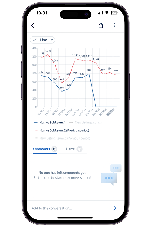
Whenever you have time series data, a natural question is “how does this compare” with a previous period, or the same period a previous year.
Zing Data now supports time comparisons versus previous periods, allowing you to easily visualize values relative to previous time periods in just one tap.
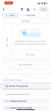
To add a time comparison to your chart or data table, simply:
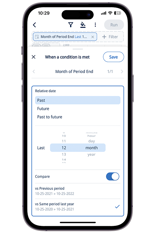
Relative dates into the future dates can be useful for looking at forecasts and having a ‘rolling’ period which always shows data relative to the time the question is run.
This new time comparisons capability makes it possible to easily see trends versus historical (previous period or previous year) data.
Often you’ll also want to know when new and relevant data differs from historical levels – such as spike or dips that requires your attention. Zing’s alerting feature makes it possible to get up proactive push notification or email alerts when new data goes above a threshold you set, drops below a threshold you set, changes by some amount, or changes by some percentage.
Once you’re alerted about an important change, you can simply tap on a chart’s line, bar, or the row of a table to drill down into that specific data point, and apply additional cuts of by other fields to inform you about the likely causes of the change.
This works for any date or date/time field, across all data sources - Postgres, mySQL, Snowflake, Databricks, BigQuery, CSV, Excel, Google Sheets, Clickhouse, Redshift, MariaDB, and SQL Server.
This time comparisons capability is live for all users of Zing, and we’re adding time comparisons into our Natural Language Querying capabilities as well.
Available on iOS, Android, and the web


Learn how Zing can help you and your organization collaborate with data
Schedule Demo