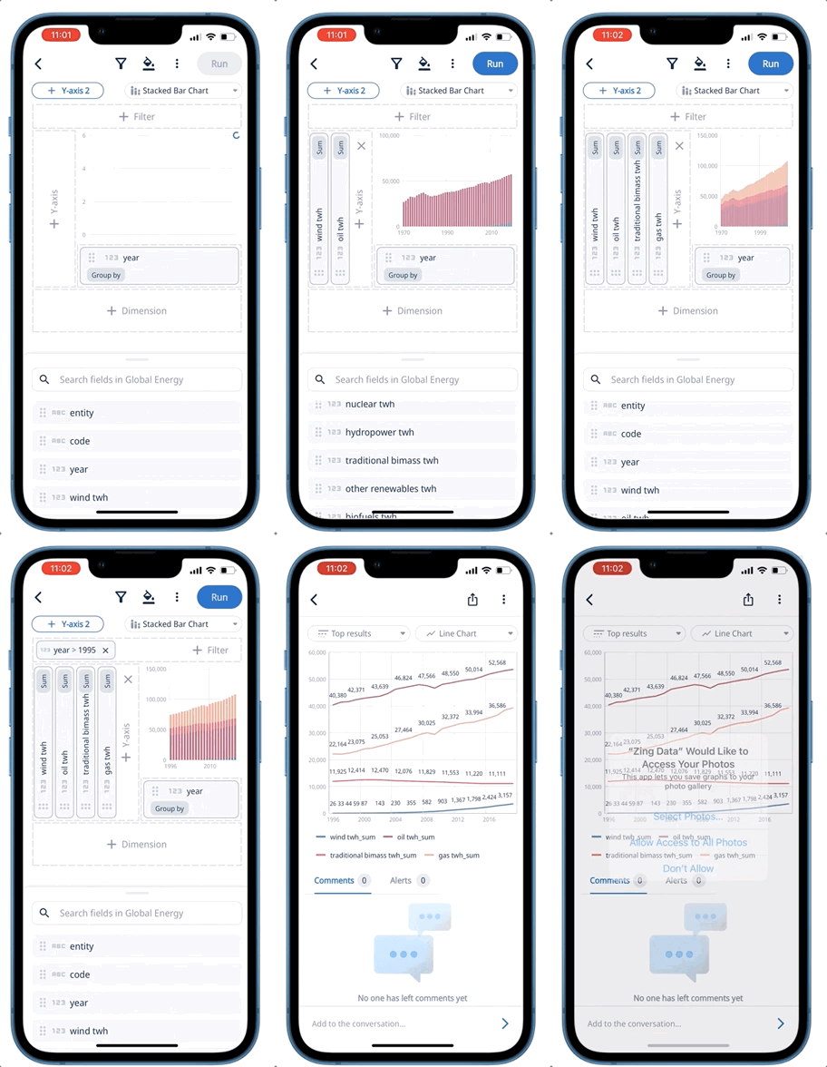
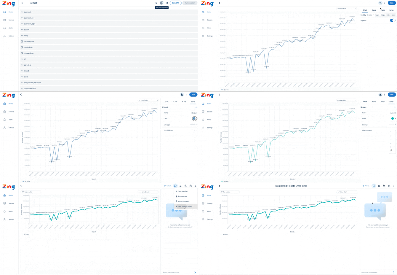
Zing’s new SwiftQuery interface lets you visually create charts, tables, and dashboards by simply dragging and dropping fields onto a graph. SwiftQuery works on iOS, Android, and the web and shows a live preview as you build questions.

Use aggregations, filters, dimensional splits, time aggregations, formatting, and varied chart / data table types to get exactly what you want.

Once you’ve created as question, save it to share with colleagues, add to a dashboard, embed in your own products, or create real-time alerts on top of.
Accessing the SwiftQuery Editor
- From the home screen (or sources screen) on the Zing mobile app or web app, tap on a table.
- Tap the ‘drag and drop editor’ icon in the top right
- Tap and hold on field, then drag it to one of the drop targets:
- X-axis
- Y-axis
- Y2 axis (for graphs with series you want shown on different y-axis scales)
- Dimension (for splits by some attribute)
- Filter (to limit results to certain values, or apply INCLUDES, EXCLUDES, or other conditions)
- Optionally, you can apply formatting to a chart including:
- Axis labels
- Tick marks
- Series colors
- Number style and decimal points
- Date style (e.g. 1 June 2023 vs. June 1, 2023 vs 2023/06/01, amongst many others)
- Legend presence / absence
- Sort order (low -> high, high->low based on x-axis or y-axis)
- Run the question
- Optionally:
- Save the question to add to a dashboard
- Share with colleagues within your organization (or if allowed in admin settings, people outside your organization)
- Export a PNG of the your graph
- Export a CSV of the data for the graph
- Add an alert to be notified when some threshold is hit
- Generate an shareable link (if allowed in admin settings)
- Embed this into your own website

