Making a graph or chart look exactly how you want (chefs kiss 🤌) is key to using the results of that analysis in emails, presentations, Slack threads, and documents with colleagues and customers. We’ve made it easier to show multiple percentiles on a graph, format how database names appear in the app (no more ‘db_1_prod’),
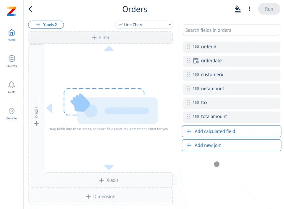
1. Calculate multiple percentiles on the Y-Axis
This new feature allows users to gain deeper insights into their data distribution by displaying various percentile values along the vertical axis of a chart. This functionality is particularly useful in statistical analysis, where understanding the spread and distribution of data points is crucial. By plotting multiple percentiles, such as the 25th, 50th, and 75th, users can quickly identify trends, outliers, and the central tendency within their datasets. This feature enhances the ability to conduct comprehensive data analysis, providing a clearer picture of the data’s behavior and characteristics, and enabling more informed decision-making based on a detailed percentile analysis.
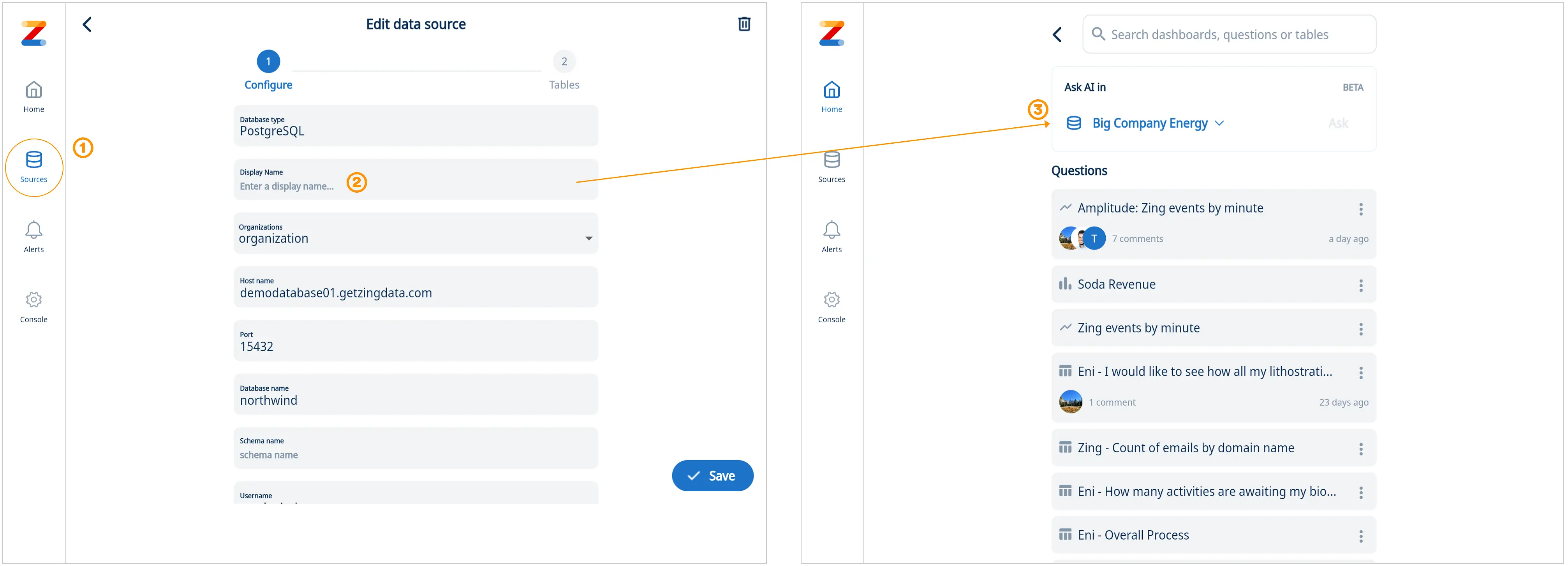
2. Data Source Aliasing
Database names often lack clarity and user-friendliness. Zing’s latest feature addresses this issue by allowing users to assign a simple display name, or alias, to their databases. This enhancement makes data exploration, querying, and chart creation more intuitive and efficient. With the ability to set short and descriptive data source names, users can easily navigate and interact with their data, ensuring a streamlined and user-centric experience. (1) Go to data sources (2) Enter your new display name (3) Go ask questions and see the new display name throughout the Zing platform
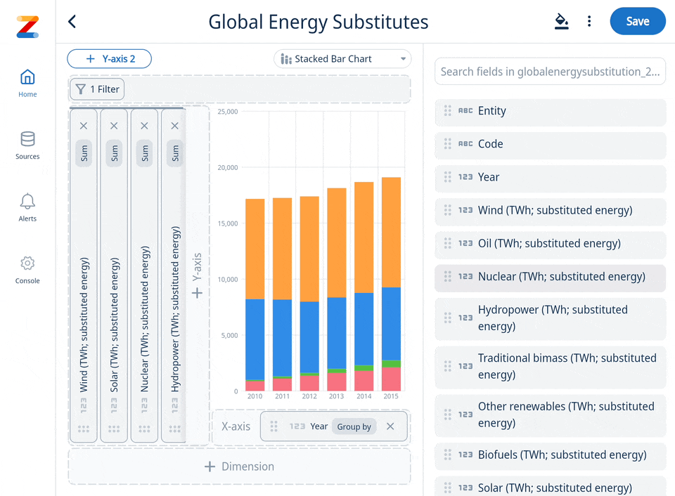
3. Define sort order for data series
To enhance the user experience and ensure viewers can quickly understand the visualization, our platform now lets you define the order series are displaed on a chart. Easily rearrange the segments within a bar charts using drag and drop functionality in the format panel. This added control allows for customized presentation of data, ensuring that the most relevant information is highlighted according to your preference.For instance, if you had data split by city, and always wanted to ensure that New York is shown at the bottom of a stacked bar chart, you could simply drag New York to reorder the series order and get the visualization perfect.
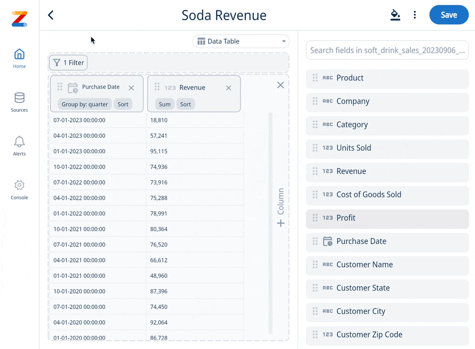
4. Intuitively sort table columns the fast way
Sorting columns server side significantly improves performance and speed, when dealing with large datasets. Instead of downloading and sorting the entire dataset on the user’s device, which can be resource-intensive and slow, or only locally sorting the partial data on the client, the server now handles the sorting logic and sends only the correctly sorted data to the client. This method ensures faster response times and a smoother user experience, as it minimizes the amount of data transmitted and reduces the processing load on the user’s device.
Get started for free! Sign In or create a new account.
Available on iOS, Android, and the web


Learn how Zing can help you and your organization collaborate with data
Schedule Demo