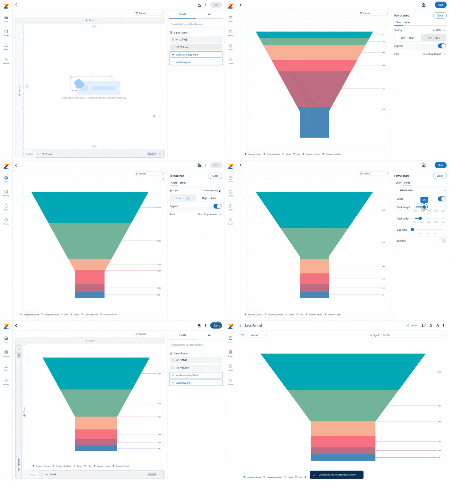
Funnel Chart: Visualize your sales pipeline, conversions, or workflows
We’re thrilled to announce the latest addition to Zing Data: Funnel visualizations. Designed to bring clarity and focus to your data analysis, funnel visualizations are perfect for tracking the progression of metrics across stages, helping you identify bottlenecks, optimize workflows, and drive better outcomes.
What Are Funnel Visualizations?
Funnel visualizations are a specialized chart type that visually represents a series of stages in a process. They’re often used in:
- Sales pipelines: Tracking leads through different stages of the customer journey.
- Conversion analysis: Measuring how users progress through sign-up flows or checkout processes.
- Operational workflows: Monitoring task completion rates across various milestones.
By narrowing down data at each stage, funnel visualizations allow you to see where drop-offs occur and provide actionable insights for improvement.
Why Funnel Visualizations Matter
In a world awash with data, it’s easy to get overwhelmed by numbers and lose sight of what’s important. Funnel visualizations stand out because they:
- Simplify complex processes: By breaking data into stages, funnels make it easier to understand multi-step workflows.
- Spot inefficiencies quickly: Bottlenecks and drop-offs become instantly visible, enabling faster decision-making.
- Enhance communication: Whether in a presentation or a dashboard, funnel charts provide a clear and engaging way to share insights with your team or stakeholders.

Get Started
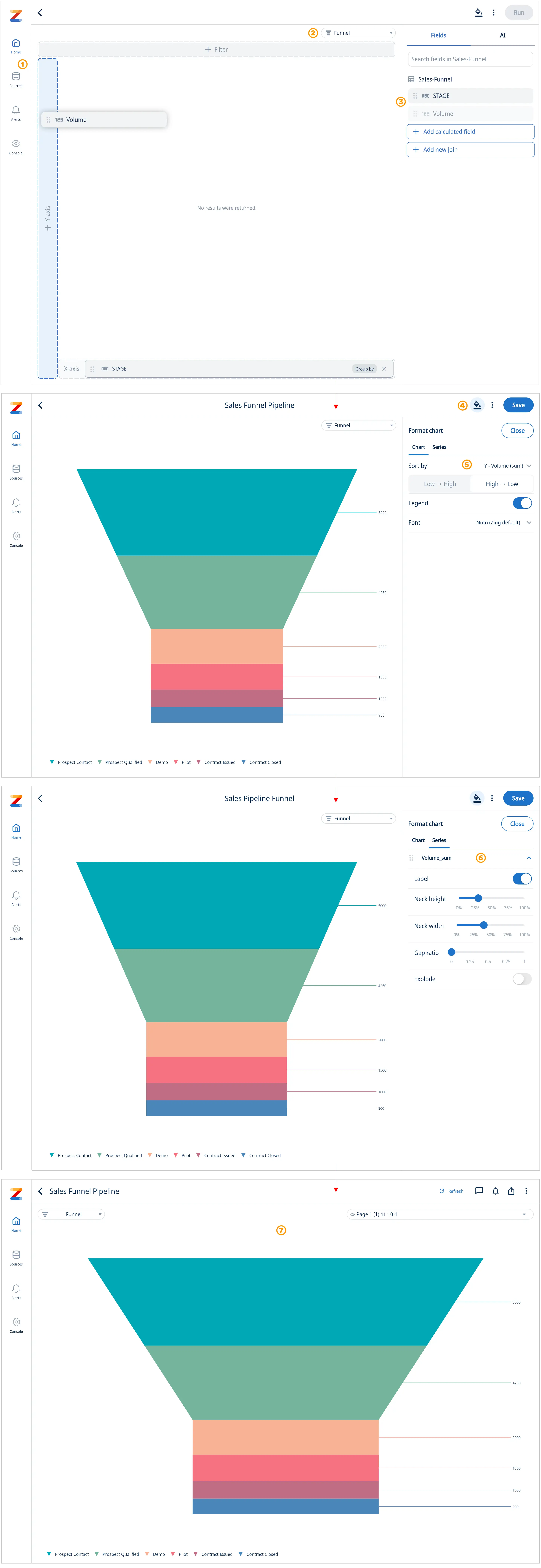
In our example below we are using a simple sales pipeline data set:
- Select a data source that contains your data
- Select “Funnel” from the chart menu
- Select and drag a field to the Y-axis and X-axis to build your funnel
- Select the format tab to fine tune your chart
- On the “Chart” tab sort Low » High or High » Low, turn the legend on/off or switch to a different if desired
- Select the “Series” tab to further fine tune the appearance of your funnel such as neck height, neck width, and gap ratio. “Explode” adds a gap between the funnel steps.
- See your completed funnel chart

Potential Applications for Funnel Charts
Funnel visualizations have wide-ranging applications across industries and use cases, including:
- Marketing Campaign Performance: Analyze the effectiveness of campaigns by tracking user engagement through different stages, such as clicks, sign-ups, and purchases.
- E-commerce Optimization: Identify drop-offs in the customer journey, from adding items to the cart to completing the checkout process.
- Customer Support Workflows: Track ticket resolution stages to improve response times and identify bottlenecks in the support process.
- Recruitment Pipelines: Monitor the candidate journey from application to hire, ensuring a smooth and efficient hiring process.
- Event Planning: Evaluate attendee progression through registration, attendance, and post-event engagement.
- Healthcare: Analyze patient flow through various stages of care, from initial appointments to treatment and follow-up.
Get started for free! Sign In or create a new account.

