Visualize Your Data and Answer Questions with Big Numbers
Zing Data now supports simple big number data visualizations allowing you to build impressive dashboards and access them from any device.
Building a big number visualization is not just fun but also very useful to see a key metric quickly by itself or in a dashboard. Select the data you want to work with from ‘Data Source’ and start building:
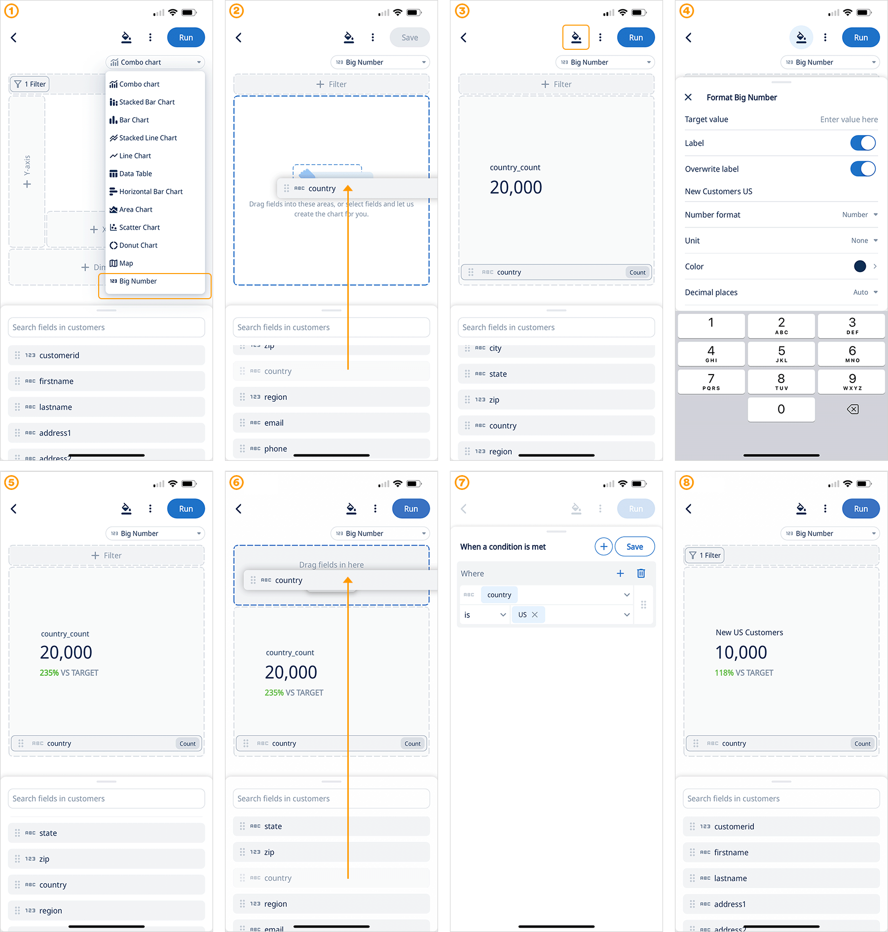
- Once you are in the chart builder select “Big Number” from the chart menu
- Drag a field into the chart builder
- Now you can see a big number, click formatting to fine tune the presentation
- In the format sheet you can quickly add a your own custom target value, overwrite the field name, change font color and more!
- Technically you are done, you have created a big number data viz!But there is more:
- Add a filter to segment your data
- Configure the filter with easy to use conditions
- Run and save your visualization!
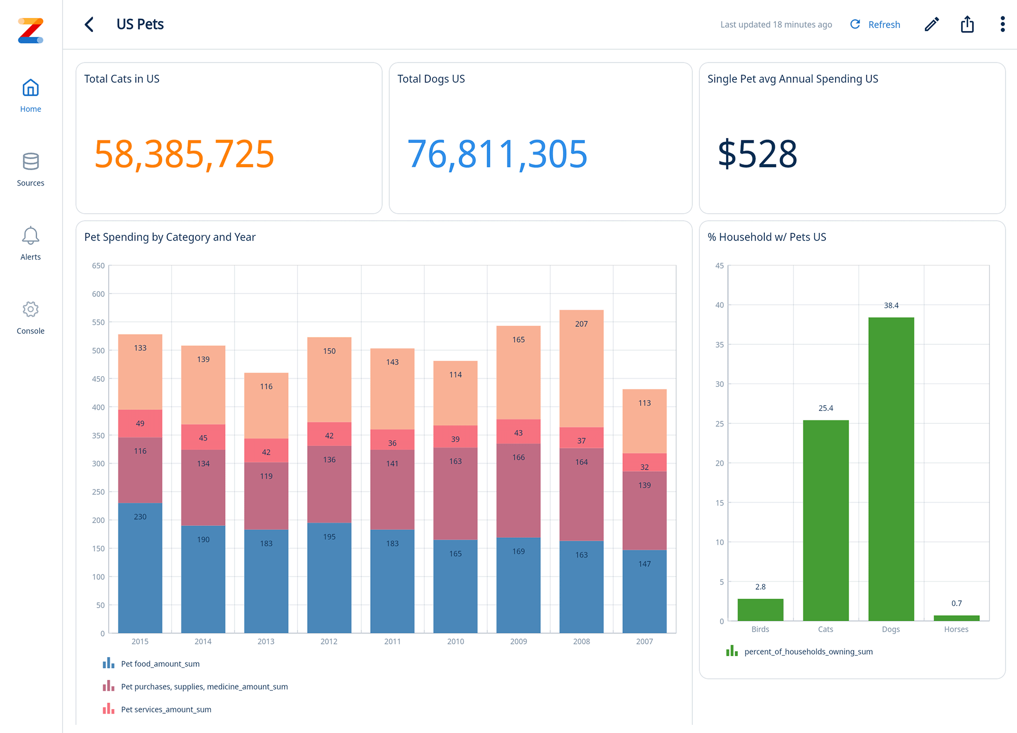
Next step: Build a useful dashboard with big numbers and charts next to each other to get insights with one glance

Here are a few tips for building Big Number charts and dashboards:
- Choose the right metric: It should be the single most important indicator of your target audience’s success. Think big-picture and prioritize something actionable.
- Label the metric clearly: Don’t assume everyone will understand what it represents. Provide a concise explanation next to the number.
- Use color strategically: Employ color to highlight the meaning of the metric. Green for positive values, red for negative, and yellow for cautionary zones can be effective.
Dashboard example

Get started for free! Sign In or create a new account.

